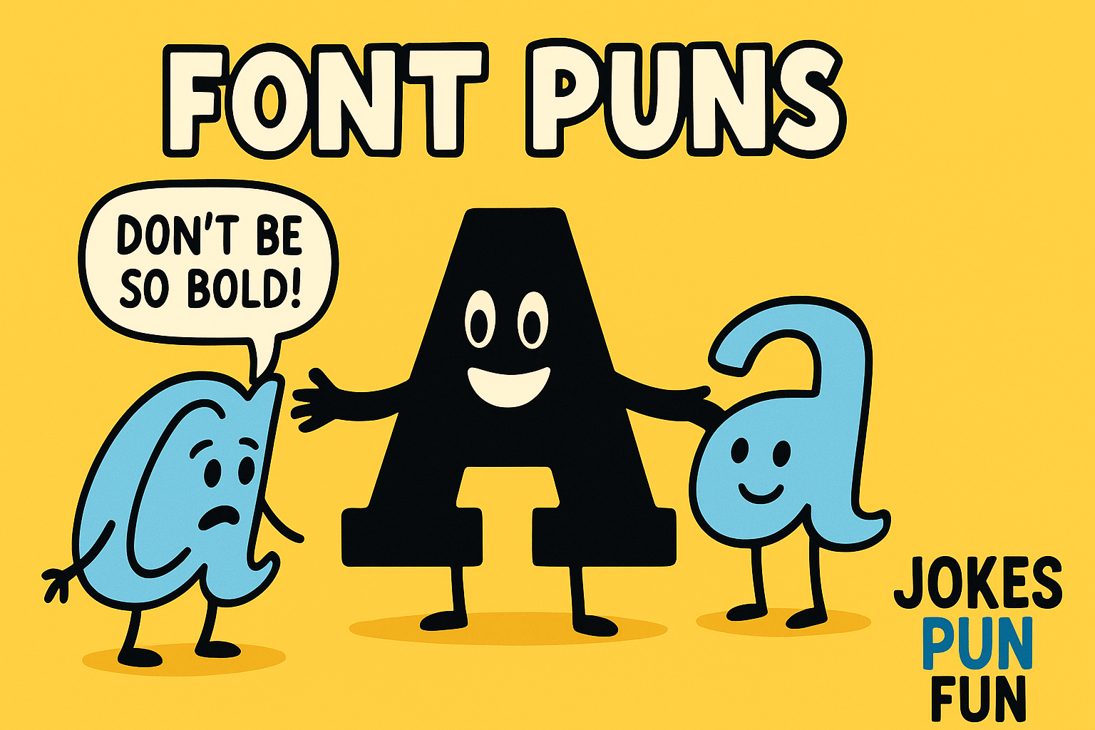
Okay, confession time: I recently spent way too long giggling over font puns. Yes, fonts! I was working late on a design and suddenly realized that Helvetica was my new best friend, while Comic Sans was still the annoying neighbor.
If you think fonts are just boring letters, think again; there is a whole world of quirky wordplay waiting to be enjoyed! So, buckle up for some of the best (and silliest) font jokes that will make you laugh out loud.
Font Puns for Designers
- Helvetica walks into a bar. The bartender says, “We do not serve your type here.”
- Why did the font go to therapy? Because it had too many issues with its kerning.
- Comic Sans tried to be cool, but it was too “childish” for the serious crowd.
- My font posed for a photo but still came out in Comic Sans.
- I told my printer I could not stand it anymore. It said, “Well, that is a bit bold of you.”
- Times New Roman and Courier walked into a room. The Courier said, “We are not going to stand here long, we have to be serif-ed to a deadline.”
- I asked my designer friend what font they use when they are feeling down. They said, “It is always Times New Roman; feels like I am running out of space.”
- Why do designers hate working with Comic Sans? Because it has no class!
- When I saw Arial next to Times New Roman, I said, “you are looking a little serif-less today!”

Typography Jokes and Puns
- What is a typographer’s favorite party trick? Kerning with friends.
- Helvetica and Arial tried to race, but they could not agree on the spacing.
- Why do fonts always get invited to the best parties? Because they really know how to justify a good time.
- You know you are dealing with a typography nerd when they say, “you are so bold.”
- Why do not fonts get good at relationships? They are always struggling with their alignment.
- A font asked a designer, “Why are you always changing me?” The designer replied, “Because I am just trying to italicize things in my life.”
- Serifs may be small, but they know how to make a big impression!
- Comic Sans told a joke and everyone just rolled their eyes; it was definitely not the right type of humor.
Font Puns for Instagram
- Just got a new font… It is a bold move, but I am feeling good about it. #FontGoals
- Feeling italicized and ready for a wild weekend. #TypographyMood
- Sorry, I am a Sans-serious person, no drama allowed here. #ChillVibesOnly
- If fonts could talk, they would be saying ‘Let us align!’ #TypographyJokes
- When life gives you a bad font, change it to something more serif-tastic. #GraphicDesignerLife
- Currently in a sans-serif state of mind. #TypographyVibes
- Catch me on the bold side of the street. #FontPuns #FeelingBold
- Love at first type. #GraphicDesignLove #FontPun
Best Font Puns
- “I met a new font today. It was a real Helvetica-tion for my soul.”
- Did you hear about the font who wanted to join the orchestra? It was going to be a sharp sound.
- Arial tried to get some attention, but no one noticed it was just too thin.
- The font tried to go viral on the internet but got blocked by a pop-up.
- Courier tried to break up with me, but I could not take it seriously; they just could not deliver!
- I used to have a favorite font, but it lost its weight over time.
- Baskerville walked into a bar. The bartender said, “We have a fine selection for you.”
- Fonts are like relationships; if they are not the right one, It is time to restructure.
- Why did the designer get in trouble at work? He got a little too bold.

Creative Font Puns
- Sans-serif fonts are not invited to formal dinners; they have no class.
- I used Times New Roman as my password, but I think I have been serif-ed out.
- Font pairing is like dating; if you are with the wrong one, it can italicize your life.
- How do fonts propose to each other? “Let us bold our future together.”
- Comic Sans was thrown out of the font party because it did not match the vibe. Guess it was a serif situation.
- Bodoni had a dinner date with Helvetica, but things got heavy and awkward. (No kerning, no fun.)
- Designers and fonts make terrible lovers; they are always trying to justify their actions.
- The font Futura walked into a room and said, “Future is now, guys; Let us get ahead of the curve.”
Funny Font Puns
- I love Helvetica so much. I always feel like I am in good type with it.
- I broke up with Comic Sans. It was a very bold decision.
- Arial might seem basic, but It is really all about that clean slate.
- Times New Roman might be classic, but It is about time it learned to loosen up.
- That font is too italic for my taste. It is got too much lean.
- In the IT world, even fonts need regular updates or they crash under pressure.
- I tried to marry Verdana, but she said, “We are just not the right size for each other.”
- Georgia was a wild one; she always bolded her opinions.
- Impact always tries too hard to stand out. But I guess that is just its nature.
Font Pun Captions
- Feeling a little bold today, are we? #TypographyMood #FontPun
- When life gives you Comic Sans, just delete it. #FontFail
- Getting serif-ed with my best life. #TypefaceGoals
- Not saying I am the best font, but I boldly stand by my choices. #GraphicDesign
- Just a couple of kerning enthusiasts living our best lives. #FontHumor
- Arial-tude on point today! #GraphicDesignLife #TypographyVibes
- Taking a break, but do not worry, I will be back to bold your day. #FontPun
- When you are in the zone, you cannot stop aligning your thoughts. #DesignersLife
Font Humor for Graphic Designers
- Why did the graphic designer break up with their font? They had a lot of spacing issues.
- Comic Sans always thinks It is funny, but It is usually just misaligned with the crowd.
- Why do graphic designers love kerning? Because it gives them the space they need to think!
- Arial did not get the job because it could not meet the standards.
- My font joined a video game and rage-quit after losing to a pixelated villain.
- Designer: “I do not get along with sans-serif fonts. They are just too shallow for me.”
- “When Helvetica tried to join the soccer team, they said, ‘We need more weight on the field.’”
- Georgia was feeling a little down. I guess her weight was too much to handle.
- Why did the designer hate Comic Sans in the office? It did not have the right curves to fit in.
Font Puns for Logos
- A logo’s favorite type of music? Bold rock.
- What is a logo’s least favorite font? Comic Sans; It is too childish for business.
- The Helvetica logo walked into a room, and suddenly, everything just felt clean and sharp.
- My logo is looking for a serious relationship; no more Comic Sans type.
- The logo designer said, “It is all about the alignment; we have got to keep it together.”
- What is a designer’s favorite way to improve a logo? Add a little kerning and give it some room to breathe!
- The logo said, “If I am going to stay in business, I need to bold my vision.”
- The new logo looked great until they changed the font to Papyrus; now It is back in the garbage bin.
Clever Font Wordplay
- Why did Times New Roman break up with Arial? It needed more space.
- Comic Sans tried to make a joke, but it just could not justify it.
- Arial and Helvetica walked into a bar. They did not talk much; it was a silent type of night.
- What did the font say to the designer? “Let us boldly go where no one has gone before.”
- When fonts fall in love, they say, “Let us get serif-ed to the altar.”
- A gamer refused to play with me because my font looked too bold to handle.
- I went to a typography party, and Comic Sans was the life of it; too bad it was not serif enough to stay.
- Baskerville knew how to have a good time, but it still did not have the right weight for everyone.
- What did the font say when it saw a great design? “I think this is the right type of masterpiece.”

And that is a wrap on the world of font puns! Who knew something so “serif” could be so hilarious, right?
I hope these jokes made you smile and gave you a reason to appreciate your fonts a little more. Until next time, keep it fun, keep it bold, and remember; kerning is key!

Meet Naveed Ahmad
I’m a national debate champion, stand-up comedian, and computer science whiz; a unique blend of intellect, humor, and tech savvy that shapes everything I do. With a sharp wit and a natural knack for storytelling, I effortlessly shift between the comedy stage and coding projects, always on the lookout for the next brilliant punchline or innovative idea. When I’m not performing or programming, you will find me powering through swim laps or creating something exciting in the digital realm. At Jokes Pun Fun I turn wordplay into a craft, bringing more laughter and clever puns to the internet; one joke at a time.